

Designing menus always undergoes a lot of iterations because we are always looking for the most user-friendly, yet cool-looking design possible. The game designer gave me a basic mockup with boxes where I could identify what elements each screen should have. And then I would try out different layouts that have all of these elements, but sometimes adding other ideas as I work that I think could improve the system in question even more. We review these as a team and I keep iterating until I nail a design and layout we consider will work the best with what the screen is for.
If the menus are very complex I will do a prototype/click dummy on Figma that the programmer in charge of taking everything to Unity can navigate in order to properly understand how everything works together. In Figma, I also create as much UI as possible so it can be vectorized and scaled as needed. But more “artsy” icons will be done in Photoshop at a bigger resolution. There is a library I set up in Figma as well with all the assets, in addition to a library of fonts and colour palettes, so everything remains cohesive.

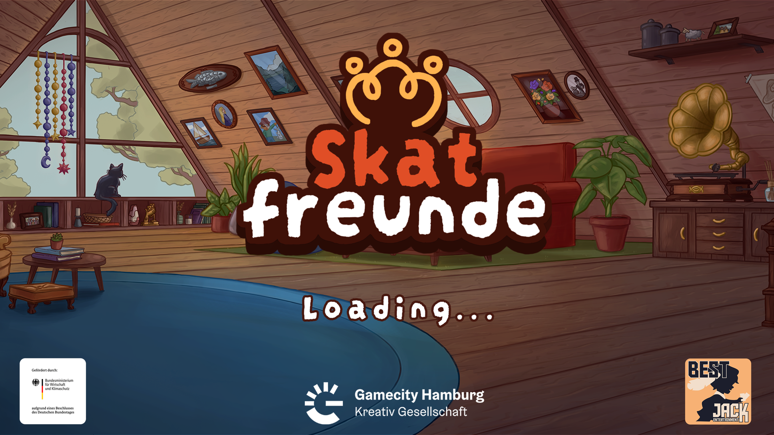
Main screen

Character Selection Menu
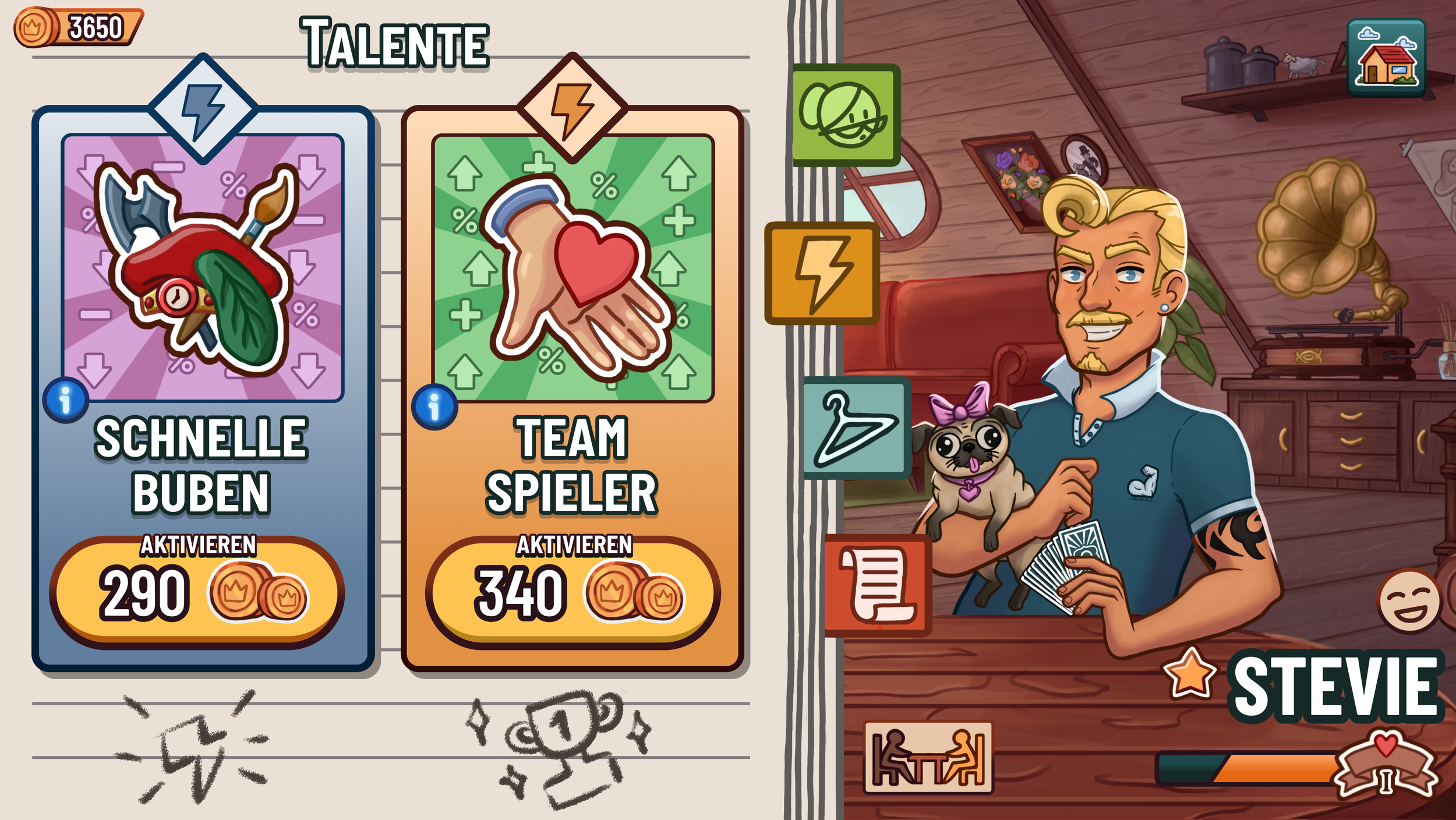
Skills Menu

Skins Menu

Profile Menu

Deck Selection Menu 1
Deck Selection Menu 2

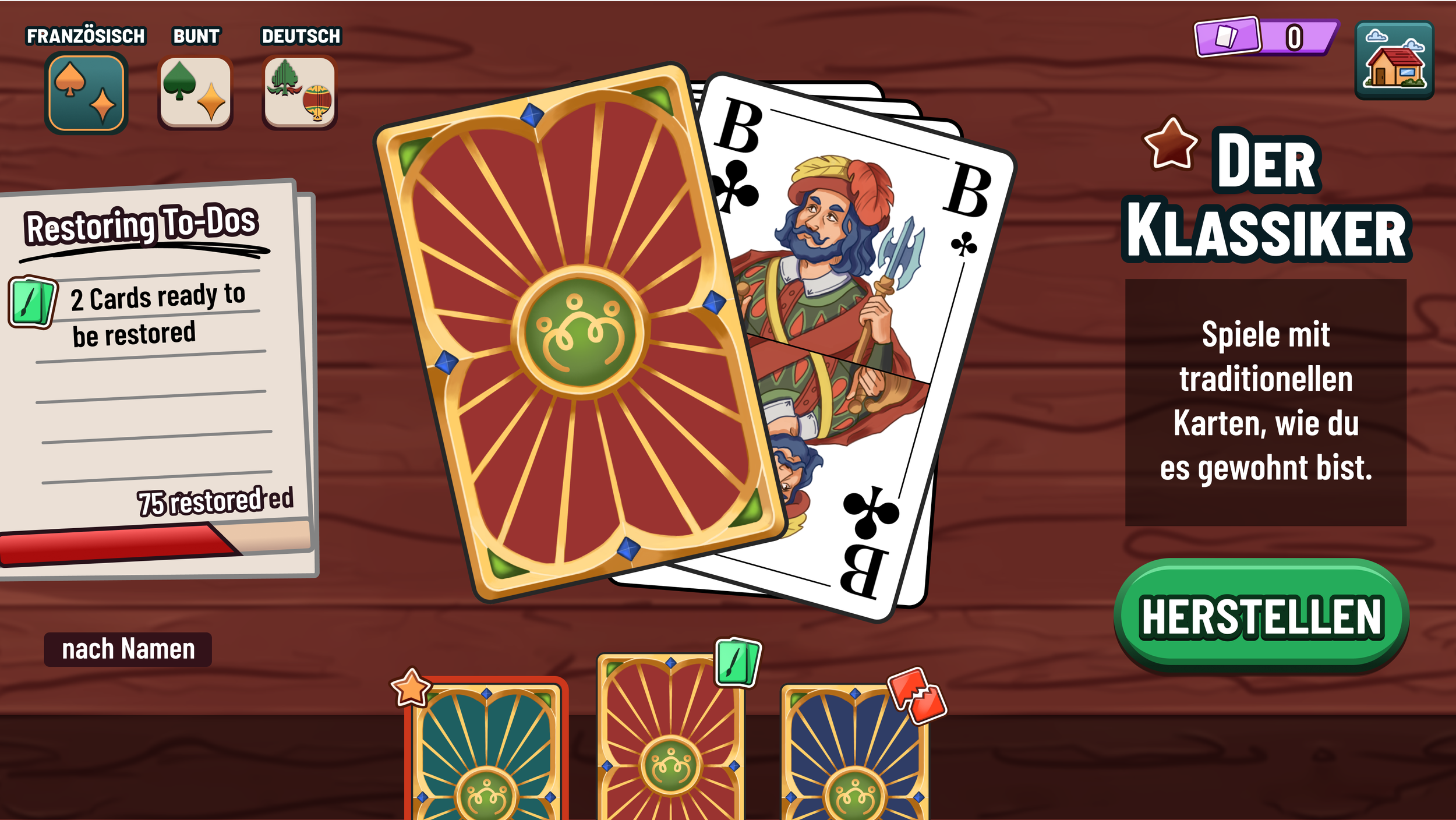
Card Crafting Menu 1

Card Crafting Menu 2

Shop 1

Shop 2
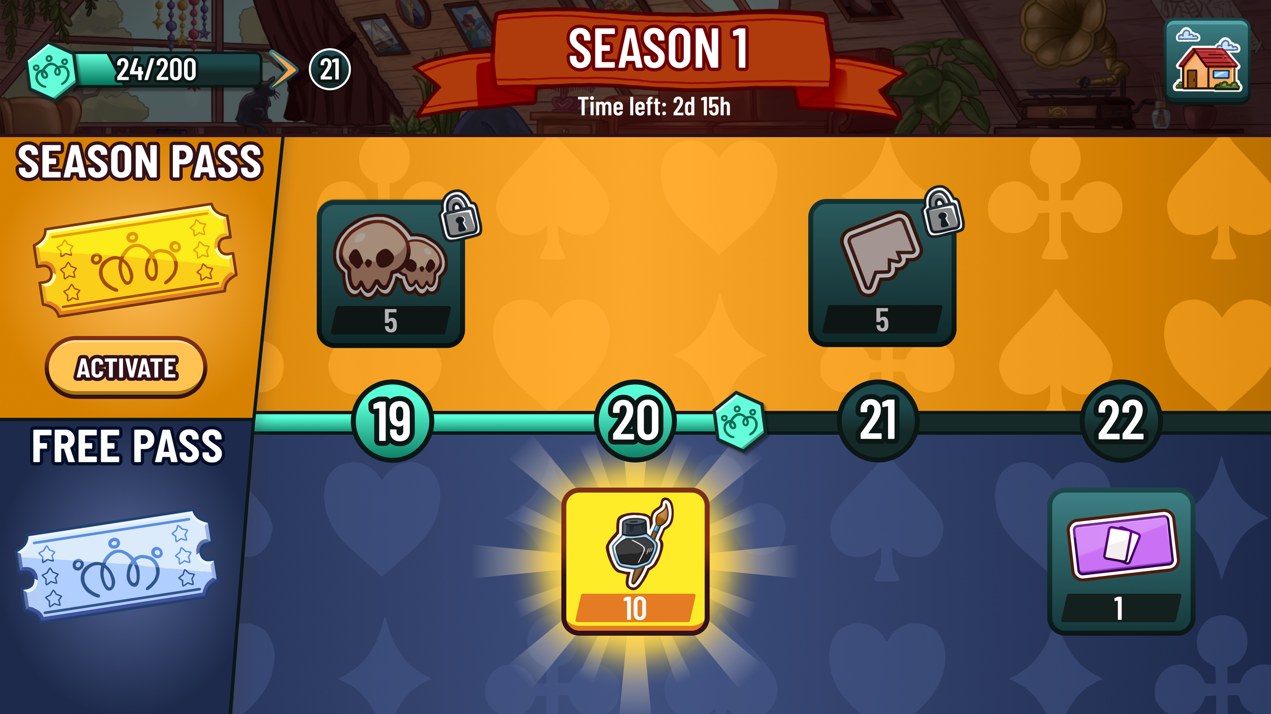
Season Road
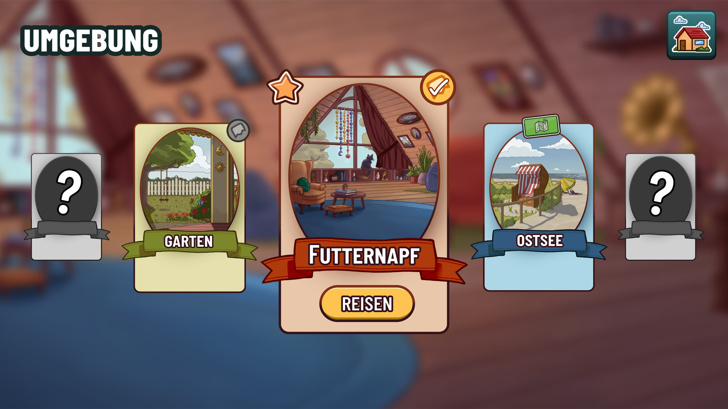
Locations